Roy Spencer and 95% of models are wrong
Claims that 95% of climate models are wrong have been making the rounds since Spencer published it on his blog in February. Here's the graph he created:
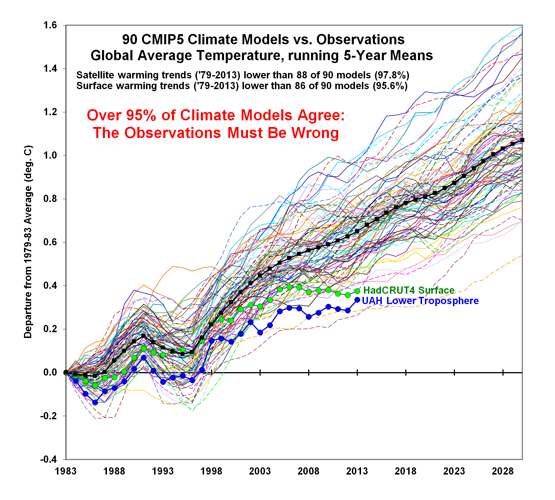
Take a good look. Not only does his graph appear to show that most models are higher than both HadCRUT4 and UAH satellite temperature record but it shows that HadCRUT4 is higher than UAH as well. That is...strange, to say the least. IPCC AR5 (aka CMIP5) models were calibrated against 20th century temperatures (1900-1999) and have only been actually predicting temperatures since 2000. However, Spencer's graph appears to show that their output is higher than the observed temperature records for 1983-1999—during the calibration period. That makes no sense at all.
What is going on? Take a look at the y-axis label. According to the y-axis label, Spencer simply subtracted the 1979-1983 average from the observations and models to create his temperature anomalies. Displaying temperature graphs as anomalies isn't a big deal. You can demonstrate that yourself easily. Get GISS data and add 14.00 (the value of their 1951-1980 baseline average—okay, 13.998 if you're picky) and graph the resultant data. Then graph the anomalies as given and compare the two graphs. They will be the same, with the only difference being the values displayed on the y-axis. The problem isn't in Spencer using anomalies. The problem is the baseline he chose. It's way too short.
In climate science, the normal temperature baseline is a 30-year average. Why? That is a long enough time period to remove the effects of weather from the baseline average. Any one year—or even a run of years—can be hotter or cooler than normal just by random chance. Those random effects cancel each other out when averaged together over longer time periods. Spencer knows this. His UAH satellite data is normally baselined to a 30-year average (1981-2010). Using just five years as a baseline means that his anomalies are subject to interference from weather, as five years is far too short to cancel out vagaries of the weather. Let's demonstrate that. Here's HadCRUT4 and UAH set to the same 1981-2010 baseline:

Notice how well the two observation records match for the entire period? Check out the 1979-1983 period Spencer cherry-picked as his baseline. Notice how UAH is always higher than HadCRUT4 for that period? That partly explains why Spencer's graph shows HadCRUT4 as consistently higher than UAH. It has nothing to do with actual temperatures. It's the difference in the baselines that give the false appearance of an actual difference. UAH just happens to have a higher baseline value than HadCRUT4 over those five years, which makes the UAH anomalies appear smaller than the HadCRUT4 anomalies. Setting the baseline to 1979-1983 makes the graph look like this:

Compare the two graphs. Now, it appears that HadCRUT4 anomalies are consistently warmer than the UAH anomalies, which is simply not true. It's a false appearance created by fudging the baseline.
Curiously, while HadCRUT4 now appears to show more warming than UAH, it's not always warmer like Spencer shows in his graph. Neither HadCRUT4 nor UAH start at exactly zero in 1983 as Spencer shows. Furthermore, Spencer's graph doesn't show the major spike in 1998. In fact, on Spencer's graph, UAH temperatures peak in 2013. It's obvious that he did something beyond deliberately fudging the baseline. The only question is what did he do? My guess is he adjusted the observational data for ENSO, aerosols, and changes in solar radiation, similar to Foster and Rahmstorf (2011), and then readjusted the baselines until 1983 was the zero point. While adjusting the data for those short-term effects was the right thing to do, fiddling with the baseline to give the false appearance that the IPCC models and HadCRUT4 were all warmer than UAH was not. It reeks of deception.
What does Spencer's graph look like without Spencer's deliberately fudged baseline?

Note how well the IPCC models matched the observations prior to AD 2000? Even after AD 2000, observations are well within the confidence interval for the models, even without adjusting for ENSO, aerosols, or changes in solar radiation. Also note how the IPCC models are generally lower than either UAH or HadCRUT4 during the 1979-1983 period, which explains how Spencer got the graph he did.
In short, Spencer created his graph by deliberately fudging a baseline to give the false appearance that the observations were far lower than what the IPCC models were predicting. What that graph calls into question is neither the models nor the observations but Spencer's integrity if he has to resort to deceiving his readers to maintain his increasingly untenable position contrary to the rest of the scientific world.
Addendum: Sou at HotWhopper has two excellent articles covering Spencer's deception with better graphics to display exactly what Spencer did:
http://blog.hotwhopper.com/2014/02/roy-spencers-latest-deceit-and-deception.html
http://blog.hotwhopper.com/2014/05/roy-spencer-grows-even-wearier.html
Take a good look. Not only does his graph appear to show that most models are higher than both HadCRUT4 and UAH satellite temperature record but it shows that HadCRUT4 is higher than UAH as well. That is...strange, to say the least. IPCC AR5 (aka CMIP5) models were calibrated against 20th century temperatures (1900-1999) and have only been actually predicting temperatures since 2000. However, Spencer's graph appears to show that their output is higher than the observed temperature records for 1983-1999—during the calibration period. That makes no sense at all.
What is going on? Take a look at the y-axis label. According to the y-axis label, Spencer simply subtracted the 1979-1983 average from the observations and models to create his temperature anomalies. Displaying temperature graphs as anomalies isn't a big deal. You can demonstrate that yourself easily. Get GISS data and add 14.00 (the value of their 1951-1980 baseline average—okay, 13.998 if you're picky) and graph the resultant data. Then graph the anomalies as given and compare the two graphs. They will be the same, with the only difference being the values displayed on the y-axis. The problem isn't in Spencer using anomalies. The problem is the baseline he chose. It's way too short.
In climate science, the normal temperature baseline is a 30-year average. Why? That is a long enough time period to remove the effects of weather from the baseline average. Any one year—or even a run of years—can be hotter or cooler than normal just by random chance. Those random effects cancel each other out when averaged together over longer time periods. Spencer knows this. His UAH satellite data is normally baselined to a 30-year average (1981-2010). Using just five years as a baseline means that his anomalies are subject to interference from weather, as five years is far too short to cancel out vagaries of the weather. Let's demonstrate that. Here's HadCRUT4 and UAH set to the same 1981-2010 baseline:
Compare the two graphs. Now, it appears that HadCRUT4 anomalies are consistently warmer than the UAH anomalies, which is simply not true. It's a false appearance created by fudging the baseline.
Curiously, while HadCRUT4 now appears to show more warming than UAH, it's not always warmer like Spencer shows in his graph. Neither HadCRUT4 nor UAH start at exactly zero in 1983 as Spencer shows. Furthermore, Spencer's graph doesn't show the major spike in 1998. In fact, on Spencer's graph, UAH temperatures peak in 2013. It's obvious that he did something beyond deliberately fudging the baseline. The only question is what did he do? My guess is he adjusted the observational data for ENSO, aerosols, and changes in solar radiation, similar to Foster and Rahmstorf (2011), and then readjusted the baselines until 1983 was the zero point. While adjusting the data for those short-term effects was the right thing to do, fiddling with the baseline to give the false appearance that the IPCC models and HadCRUT4 were all warmer than UAH was not. It reeks of deception.
What does Spencer's graph look like without Spencer's deliberately fudged baseline?
Note how well the IPCC models matched the observations prior to AD 2000? Even after AD 2000, observations are well within the confidence interval for the models, even without adjusting for ENSO, aerosols, or changes in solar radiation. Also note how the IPCC models are generally lower than either UAH or HadCRUT4 during the 1979-1983 period, which explains how Spencer got the graph he did.
In short, Spencer created his graph by deliberately fudging a baseline to give the false appearance that the observations were far lower than what the IPCC models were predicting. What that graph calls into question is neither the models nor the observations but Spencer's integrity if he has to resort to deceiving his readers to maintain his increasingly untenable position contrary to the rest of the scientific world.
Addendum: Sou at HotWhopper has two excellent articles covering Spencer's deception with better graphics to display exactly what Spencer did:
http://blog.hotwhopper.com/2014/02/roy-spencers-latest-deceit-and-deception.html
http://blog.hotwhopper.com/2014/05/roy-spencer-grows-even-wearier.html


The first version of this post contained this incomprehensible sentence:
ReplyDelete“Not only are of the models higher than the UAH satellite temperature record but HadCRUT4 is as well.”
In the present version it has been improved to:
“Not only does his graph appear to show that most models as higher than both HadCRUT4 and UAH satellite temperature record but it shows that HadCRUT4 is higher than UAH as well.”
Better, but still not right.
1. Not only does his graph appear to show that most models are higher than...
2. Not only does his graph appear to show most models as higher than...
Thank you for the edit.
DeleteEven your own chart makes Spencer's point! The models are wrong. Of course the models match PAST data, but they did a horrible job predicting the future.
ReplyDelete