Posts

New blog home!

 As you already know, I use R and RStudio for all of my data analyses. While Blogger is perfectly adequate for most needs, I've personally found it to be cumbersome when trying to publish anything with graphs from R. I've always had to export graphs from RStudio and then reimport them to this blog. And don't get me started on formatting R code for publication. I cringe when I see how my code was mangled by Blogger. Accordingly, I'm moving my blog to  Quarto Pub . Quarto is a newly released version of RMarkdown, both were originally created for R and RStudio. Quarto allows me to merge R code and output with text to create blogs, reports, presentations, and even entire websites, all from RStudio on my laptop. Anyone can now access my code, reproduce my results, and improve upon my analysis, right from my blog post. No need for separate posts or blog sections on code. Hope to see all of you over at my new site (URL:  https://jrmilks.quarto.pub/seeing-the-environmental-f

Global temperature widget

Image
 I've created a web-based app that calculates linear regression trends on the Cowtan-Way global temperature data set  using annual mean temperature. The reason I picked that particular data set is simply that it's one of the easiest of the surface temperature data sets to download to R.  I chose annual data because red noise is insignificant at that scale so we can go with linear regression without worrying about autoregression. The app was made using the Shiny app in R Studio. When you open the app, you're greeted by a single page with two input boxes on the left-hand side. You enter the start year in the top box and end year in the bottom box and the Shiny app does the rest. The output includes the linear temperature trend per 100 years, the 95% confidence interval for that trend, a graph of the data and trend, complete with 95% confidence interval lines, and at the bottom the actual R output listing the model and fit statistics like the R 2 statistic.  I've demonstr

Shifting Bell Curves revisited

Image
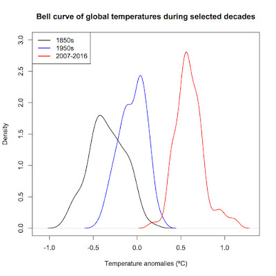
 It's been a few years (close to four) since I last wrote a post. Yes, I'm still alive. Life just...got complicated for a bit. While much has been happening, it seems that outright climate change denial is finally dying, probably because we're already seeing it happen before our very eyes. In this post, I'm revisiting the Shifting Bell Curves I first wrote about in 2013. Here we go. One of the tenants of climate change is that it changes the frequency and probability of climate-related events. Here I use NCDC data broken into decades to show how the frequency of monthly global mean temperatures changed over time. We're all familiar with time series plots of temperature data such as the one below showing that global mean temperatures have risen by an average of 0.179ºC per decade (95% confidence interval: 0.171 to 0.188ºC) since 1970. However, this way, while still informative, doesn't allow the reader to really grasp just how much the distribution of monthly me

Christopher Booker doesn't understand trends

Image
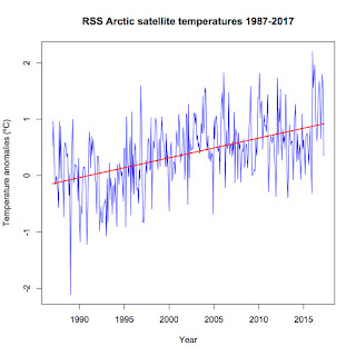
Christopher Booker, a journalist for The Telegraph in England, has a long history of disputing scientific facts. Not only does he dispute climate change, he also disputes the link between smoking and cancer (hey, he fits right in with Heartland Institute) and the negative effects of asbestos. On May 6, 2017, he published yet another column on climate change proclaiming that all is well. Titled " Another Arctic ice panic is over as world temperatures plummet ", it has been quickly picked up by the usual science denial websites. As usual. Never mind that it's chock full of misinformation and outright ignorance. Let's get started. First up, the selected facts present in the following paragraph in his article:  "But last week we were brought back to earth by the Danish Meteorological Institute (DMI), as charted by our friend Paul Homewood on his blog Notalotofpeopleknowthat, with the news that ever since December temperatures in the Arctic have consistently be

Meltdown: An early prediction of September 2017 Actic sea ice extent

Image
Yes, I'm a bit late but the Arctic is in full meltdown this year. I crunched the numbers for April ice extent and found that this past April saw the second-lowest Arctic sea ice extent on record. Since 1979, average sea ice extent in April has declined by 1,403,600 square kilometers, an area nearly the size of Alaska and over twice the size of Texas. (Alaska has an area of 1,717,854 square kilometers and Texas comes in at 696,241 square kilometers. You can find a list of all 50 states at ThoughtCo.com in case you're curious). Even more worrisome is the record low average extent in the first four months of this year. Average monthly January to April extent has fallen by 1,626,860 square kilometers since 1979. This record low comes in spite of neutral ENSO conditions, indicating that something has changed in the Arctic and not for the better. Sea ice volume makes the point even more clear. So far, sea ice volume is setting new record lows, meaning there is a lot of th

R code for Shifting Bell Curves

Image
A commentator named Jonathan asked for the code by which I produced my bell curve graph way back in 2013. Here it is. Note : I'm using the Cowtan and Way 2.0 temperature reconstruction in this example rather than NASA GISS as in the original post as the Cowtan and Way data is more accessible for use in R. >Cowtan<-read.table("http://www-users.york.ac.uk/~kdc3/papers/coverage2013/had4_krig_v2_0_0.txt", header=F) > names(Cowtan)<-c("Year", "Temperature", "Uncertainty1", "Uncertainty2", "Uncertainty3") #Name the columns > summary(Cowtan) #Check to see if the column names look right and the data imported correctly > S1850s<-subset(Cowtan, Year<1860) #Get subsets of each decade > S1950s<-subset(Cowtan, Year>=1950 & Year<1960) > S2007<-subset(Cowtan, Year>=2007 & Year<2017) > D1850s=density(S1850s$Temperature) #Get the density kernals > D1950s<-density(S1

Mt. Etna vs Humans

Image
Yes, I'm still around. I've just been fairly busy the past few months. The long-debunked myth that Mt. Etna emits more carbon dioxide in one little eruption than human activities have for our entire history as a species has recently reappeared on my social media feed, courtesy of a right-wing cousin of mine.  I just thought I'd do a quick comparison showing just how wrong that myth is. Using data from tables 2 and 3 in Burton, Sawyer, and Granieri (2013) for volcanic emissions and Boden, Marland, and Andres (2017) for human-related carbon dioxide emissions, I get the following comparison between an entire year's worth of Mt. Etna CO 2 emissions and just one year's worth of human-caused CO 2 emissions. Mt. Etna produces an average of 7.22 million metric tons of CO 2 per year. That's TOTAL per year, not just "one little burp." In contrast, humans caused 36.14 BILLION metric tons of CO 2 emissions in 2014 alone. Mt. Etna emissions aren'